
When presenting data to support your presentation’s storyline, using tables filled with numbers should often be your “option of last resort.”
Why? Because data formatted in tables can make it difficult to compare items being measured. Tabular data can also obscure trends that emerge over time.
Your goal is to keep your audience’s attention and gain their buy-in.
Making them struggle to interpret your data is a great way to lose them. Here’s a quick example of the problem.
Imagine you’re giving a presentation and planning to use either Option A, the table, or Option B, the graph, to support your position. Both options shown below represent the exact same data.
Which do you think will help your audience more quickly and easily spot both the important comparisons and the trends you want to highlight?
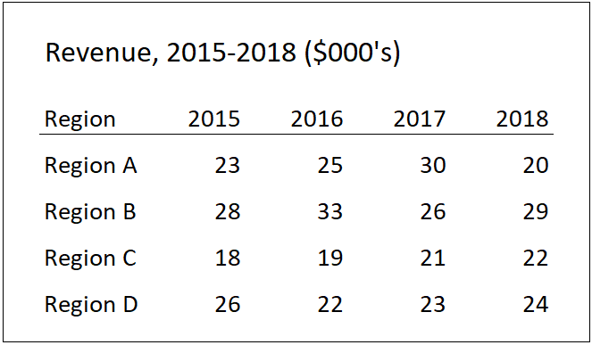
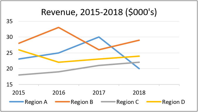
It’s pretty clear that the graph in Option B provides a clearer, quicker-to-grasp view of what’s going on in each of the four regions.
Even though graphs are often more effective than tables, there are times when a table is the best way — or the only way — to successfully present data supporting your message.
If that’s the case, here are some simple guidelines you can follow for using tables effectively in your presentations.
One too many notes? Less is more when presenting tabular data.
In the movie Amadeus, Emperor Joseph II compliments Mozart on his new composition, The Marriage of Figaro. But after heaping praise on the new work, the Emperor then famously surprises Mozart with his opinion that it has “too many notes” and would be better with fewer of them.
Although an embarrassingly uninformed thing to say in that situation, in other contexts the “less-is-more” approach can produce powerful results. This holds especially true when presenting tabular data.
Follow these 3 simple guidelines when using tables to present data.
- Round numbers.
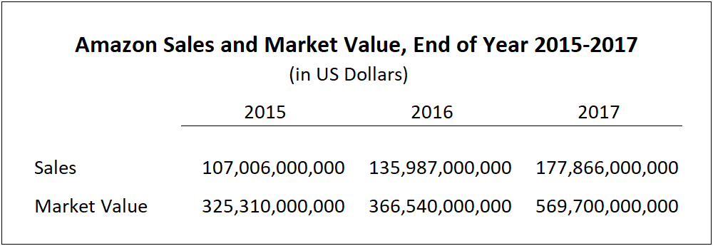
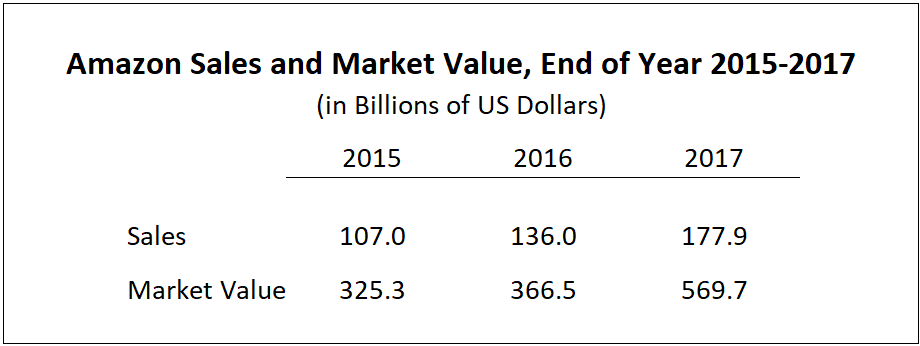
Round away any extra numbers that aren’t providing useful information.For example, do you need to present the number 79,413,295 in your table to accurately convey your idea? Or will rounding it to 79.4 million do the trick?Always ask yourself, “How much value is there in showing the full number? How accurate does it need to be to support my message?”Here are two simple tables that use an extreme example to demonstrate this point. Both present the same underlying data, yet show that too much data, or “too many notes” as the Emperor said, can be overwhelming and unnecessary:
—vs—
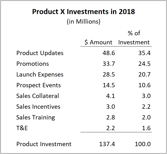
- Scrimp on signs.
If you have a column or row of numbers that represent the same type of number, often a currency or a % of another value, don’t make your audience waste brain cycles by unnecessarily showing them multiple $ or % signs.If every number in a column or row is of the same data type, declare that type in the header and don’t repeat it again inside the data table.Here are two tables that highlight the benefit of this less-is-more rule: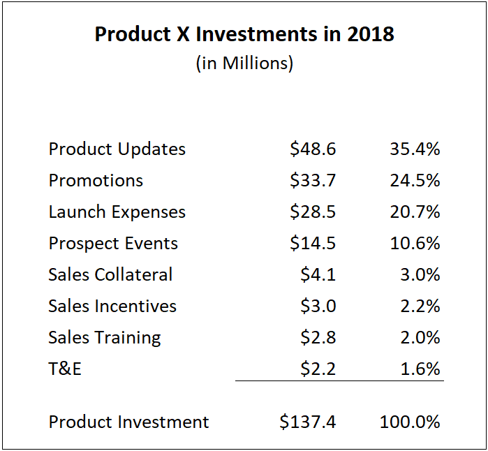
- Combine items.
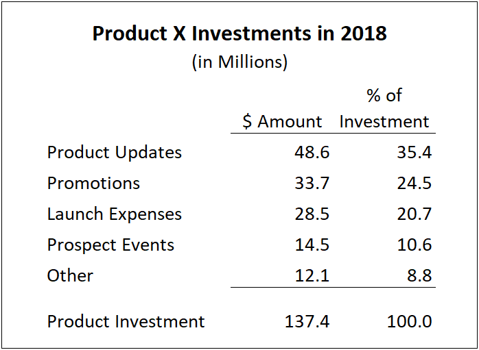
Your data table may present more information than your audience can quickly process and understand—again, “too many notes.” Look for opportunities to combine different data items whose values aren’t material to making your key points.A quick rule of thumb is that a table shouldn’t contain more than 5 lines of data. Any more than that could make it difficult for your audience to quickly grasp the table’s meaning.It’s often the case that 20% of your data items provide 80% of the relevant data you have. Consider showing only that top 20% of the items. Then, consolidate the remaining lines into a line called “Other”.Here’s an example of that guideline applied to the previous chart on “Product X Investments in 2017.” Again, less can be more.
Remember Emperor Joseph II
Keep these three simple guidelines in mind when you’ve decided to include tables in your presentation.
The Emperor’s idea of “too many notes” may have been misplaced when addressing Mozart’s new opera, but it’s well suited to preparing data tables designed to support your messages.
Learn More
At Mandel, we’re proud to offer what we believe is the world’s best presentation skills training. We always encourage the use of effective supporting data to help tell a story. Whether you’re using tables, graphs, or other visual data to tell your story, we have the right people, products, and services to help you be successful.